
Savoury Crunchy Snaxy
'Rax' grabs attention instantly, feels exciting, and still delivers strong commercial clarity across.
Background
Snax is targeted for the Myanmar market, targeting all ages with a product that is simple, craveable, and easy to love. In a crowded snack aisle, the challenge is not just visibility but memorability. The brand needs to feel fun enough for younger audiences, while still holding a strong commercial appeal for mass consumption.
It calls for a visual identity that is bold, clear, and instantly recognizable across shelves. Something that captures attention fast, communicates flavor, and stays approachable for everyone.
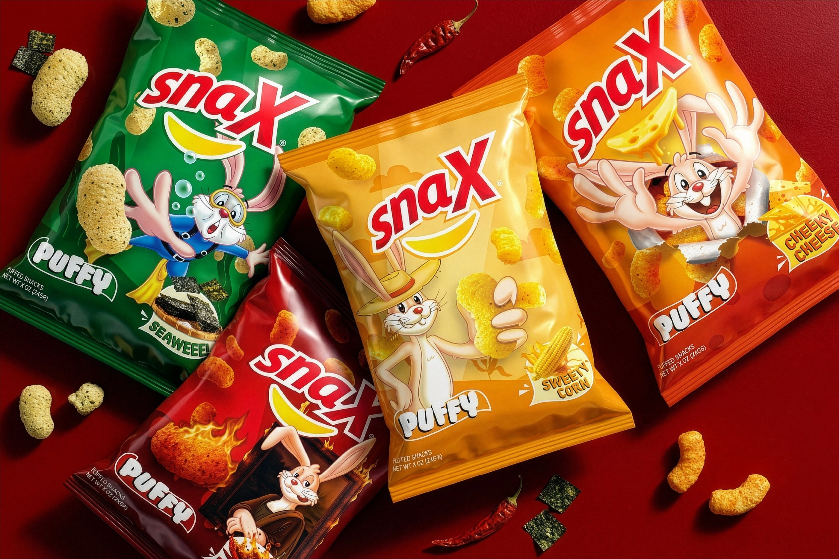
Concept
We create a playful yet commercial brand world anchored by 'Rax the Rabbit'. A mascot designed to carry energy, appetite, and attitude. Rax becomes the face of Snax, bringing a sense of movement and excitement into every pack.
The visual system leans into puffed forms and rounded shapes, reflecting the light, crunchy texture of the snack. Typography is bold and friendly, while colors are vibrant and flavor-driven to create strong shelf impact.
Rax interacts with the packaging in dynamic ways, amplifying the snacking moment and reinforcing the brand’s personality. Fun is pushed forward, but always grounded in clarity and product focus.
The result is a brand that feels lively, accessible, and built for scale. A snack identity that stands out, connects across age groups, and delivers on both fun and commercial performance.
Impact
Reached
Myanmar Market